Wednesday, 31 October 2012

Run Cycle Practise

 
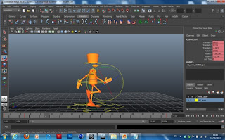
Following the walk cycle practise I did, I also wanted to experiment with other forms of movement using the same rig. This time I decided to make the character run & then collapse to the floor as it gets tired from running. The first thing I did was look at this guide for inspiration:


I did this cycle in 33 frames again. As you can see I have a fairly decent running motion here. The frame rate is abit slow and the arms need better alignment. But the next thing I wanted to do, was animate a falling sequence at the end.


I found this drawn sequence online, it was the nearest thing I could find that resembled a fall. I decided to somewhat use this as my influence but wanted to exaggerate the fall by having my character's arms swing out and quickly catching itself, to give more emphasis.
 
 
This is my final output. I am fairly happy with this, although the legs would probably hit the ground more abruptly in reality and I was unsure if the face would most likely be looking away from the ground instinctively. I would improve this by possibly removing the 4th frame, to make the fall more sudden.


Monday, 22 October 2012

Making a Final Character Design

After coming up with a few ideas, I had to make a decision on what kind of final character I'd want to produce. I decided that I wanted to create a slightly mystical character who appears sinister and has an unhinged sense of humour. I want him to be fairly wild-like and not be too influenced by human civilisation, so i'm basing my character in a woodland environment. He will have tree like qualities to him so he will appear skinny like a tree branch and have the skin tone textured like tree bark.


The design of this character was initially very influenced from Tim Burton's style of stick thin characters. I feel this last drawing I've done comes across Manga orientated, which I don't want to have that feel in the final modeled look. I may need to test whether this would lose that style habbit in a non cel-shaded render. I also wanted to give my design long hair, so at times you won't be able to see his face which will add to his ominous appearance.  I would target this character towards young people in their teenage years and older.

'Vincent' by Tim Burton

I plan to think up some ideas of what kind of scenario I want my character to be animated around in, once i'm entirely happy with my characters design as this can potentially affect the animation piece itself.

Thinking about the practicality of building this character in Maya, it shouldn't be too much of a problem to model. My main concern currently is how I would create the hair. I will need to do some research on methods of adding hair to models effectively before going ahead with this as my final design.

Visual Research

I've looked at various different character works from designers and animation teams. and created a mood board as such to inspire my final character design. I'm currently drawn to creating a character who will appear ominous. So works from sources such as Tim Burton and Edo period Japanese art will greatly steer me into that direction.


Friday, 12 October 2012

Designing A Character

To begin my character design, I had a good think about what kind of character I could have in my animation. I first brainstormed some ideas. I intend to make sure the character I have is in a humanoid form, which makes the rigging easier to control rather than having more than 2 arms and legs, which could over complicate things for this practice.

I find my best way of coming up with character ideas is to first try drawing down on paper what comes to mind first and then expand these ideas by looking for inspiration online and at other peoples works.

These are designs based around alien features. I wanted to make my character long and skinny. I was inspired to make the face look as creepy as I could make them. The left character's mouth was inspired from Doctor Who, whilst the middle characters face I relate the striking eye resemblance to the Daruma piece and the character design on the right I wanted to make an alien which had legs for ears and a striking face which makes me think of the statues found on Easter Island. The middle character on this page is my favourite design as it has a detailed face and all rounded good designed body. It looks rather ominous with its lanky body and striking face.


With these designs, I was thinking more about basing the character around a costume/shell/skin. I was heavily inspired from some of Michael Jackson's costumes from his shows. The far left design is a mix between megaman and one of his costumes. The second one I felt as if it could have an asian appearance, so I added a turban. The third design I wanted to look spikey & have scorpion like points, whilst having a blocky face. Lastly I have a robot looking, metalic armoured character.


I also tried drawing some humanoid animalistic characters. The first two are birdlike, the first being a penguin and the second more or a parrot/peacock appearance. I wanted them both to have sharp eyes like birds tend to have. The third design is a cow but in a devilish style, using long horns and giving it a human kind of body. It reminded me of a character from Final Fantasy 8. Lastly I wanted to draw a mischievious looking character, So i went with a cat... As I went on to draw it, I realised that it more or less became Puss in Boots.


Walk Cycle Practise

One of the most important things an animator must learn in character animation is how to create a walk cycle. There are four main poses which are used to keyframe a walk, known as: Contact, Recoil, Passing & High point. These are swapped round for each leg and loop in pose to make the illusion of walking. To begin with, I took some photos of myself walking across the room to understand these poses:


To get a better grip of these poses needed to create the movement correctly, I then drew a diagram of each stage. A well animated walk cycle averages from 33 frames. So the frames are devided for the following poses;

Frame 1 - Contact,  Frame 5- Recoil,  Frame 9 - Passing,  Frame 13 - High-point, 
Frame 17 - Contact, Frame 21- Recoil, Frame 25 - Passing, Frame 29 - High-point,
Frame 33 - Contact

For practice, we've been given a ready rigged character for us to learn how to animate a
realistic walk cycle in Maya. Using my drawn guide, I can keyframe these positions which should then result as a fully walking character.


After adding the walk cycle with the legs, I wanted to give movement to the arms and make the waist move side to side with the legs. First I selected the mid spline rig for the characters waist and changed the Y rotate to -15 on frame 1. Frame 16 I then changed it to 15 and changed it back to -15 on frame 33. After test playing, you can see the movement also makes the shoulders move back and fourth.

Lastly I wanted to make the arms swing back and fourth to give the character a much more lively movement. I used the chart in the same way I animated the legs.


The arms are controlled by a rig which is placed around the wrist area. This is a separate rig to the once which controls the finger movements. To make the arms match the diagrams, I had to make sure I used the Arm twist and Y Rotate values mainly for it to bend properly.


This was the result I achieved after adding movement to the arms and waist. You can see that there is an error I made in the left arm, as it bends out of place. I needed to check the Curve chart and make the arms more symetrical.

Monday, 8 October 2012

Edge loop/Edge flow


I found a website which shows the importance of edge looping and how they're they're placed for when movement occurs and deformation happens in animation. They're used to separate areas and define shapes and direct edge flow.
Below, I found this interesting as it shows the main areas which are effected in movement;
http://www.cgmascot.com/design/modeling-for-animation-body/
'What are the Main Masses moving in a human/humanoid?
 
  • Back of a character bends below the chest.  You need loops going around the torso.  Chest bends too, even the rib cage below deforms, however the musle masses on chest and shoulder & back-area have more effect on the shape change, shoulder having clearest effect. You should have flow from chest directed to flow over the shoulder and to the back. Please note my optimization here has lead to a pole, a 6 edges intersection, in the middle of the back. It is not troubling me, but if you build similiar mesh you may want to add few polygons in that region to get rid of the pole.
  • The arm-mass connects to the shoulder and the problem area is over the arm-socket.
  • Head and neck moving about affects the area around the neck and some ways to the back.
  • Legs move the buttocks as well.   The mass movement limits to top of the hip bone, pretty much.
  • With arms and legs the problematic bits are knee and elbow both. Masses of back- and forelimb come together and separate there.  The loops help to give more mass on the outside part of the bending limb, giving material for both parts that bend away and a centerline that stays more or less in place. You may get by with a tube-like structure here for cartoon-characters where things aren’t that exact OR by having many loops that you carefully weight to bones to deform just right.'

Bouncing Ball Exercise

To learn to use Maya correctly in Animating. We practiced with a sphere and used the S Curve tool to change the flow of movement. To make it more realistic I made a quick attempt to slow down the speed as the ball bounces back up and down until it comes to a complete stop.


Although this looks rather rough & not quite how a ball would physically bounce in an environment. It's been some practice on how to use the S curves which will be handy for animating later on.

Friday, 5 October 2012

What is Good Geometry?

To create a good object for animating, it's vital to have good geometry to make it as versatile as possible. Depending on the complexity of a character or object will determine what movements it is capable of achieving to make a nice flowing movement, without the mesh overlapping each other.

It's important that the Polygon count is considered for the complexity of the model's planned movements. For example, you will likely find more edge loops around a characters arms, elbows and shoulders. These are areas in which the arms and legs would bend, the higher the poly-count, the smoother the model will be.

Looking at these examples, you can compare the uses:


This model here would be incapable of having smooth movement. If you look at the creases for the arms and legs, you can see that if this was rigged and movement occurred, the model would de-form as the limps moved. The neck is also too basic, so the head would be unable to turn. Also notice the Engons on the front of the body, these could also be problematic during movement.
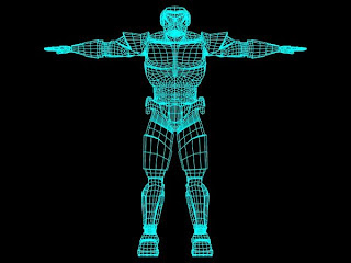
This model is much more prepared for movement. You can see the increased number of edge loops at the knees and elbows of this character. The Stomach even has a high number of vertexes which would allow for the stomach to smoothly move with the rest of the body's movements.


It'll be very important as I design my own character to take into consideration of the required movements I will be needing to make, as this will affect how the designed character is modelled.